Mood-Enhancing Window Treatments: Using Color Psychology to Transform the Room
It’s a midnight snack attack. You had one at 8 PM, at 10 PM, and now this.
Maybe it’s because you worked out extra hard — 20 minutes on the treadmill instead of 10. More likely, it’s because your kitchen is painted the most delicious shade of yellow.
It’s no secret that colors affect our mood and that yellow can stimulate feelings of happiness and hunger. Look no further than myriad fast food logos across the USA. Reds and yellows dominate. Chow down, America.
How does all this relate to window treatments? Choosing the right color for your curtains, blinds, or shades can have a significant impact on your mood and the ambiance of your home.
Understanding Color Psychology
Color psychology is the study of how different colors affect our emotions, behaviors, and perceptions. Different colors evoke various feelings and can influence our moods and energy levels. Here’s a brief overview of the psychological associations of some common colors:
- Red: Associated with passion, energy, and warmth. It can stimulate appetite and conversation, making it a great choice for dining areas.
- Blue: Known for its calming and soothing qualities. Blue is often used in bedrooms and bathrooms to create a sense of tranquility.
- Green: Represents nature, growth, and harmony. It’s an excellent choice for areas where you want to promote relaxation and balance.
- Yellow: Radiates positivity, energy, and happiness. Yellow can brighten up any space and is perfect for kitchens and playrooms.
- Gray: Conveys neutrality and balance. It’s a versatile color that complements various decor styles.
- Purple: Symbolizes luxury, creativity, and spirituality. Purple lends opulence to bedrooms and living rooms.
- Orange: Combines the warmth of red and the energy of yellow. It’s a bold and playful color often used in children’s rooms.
- Black: Represents strength, sophistication, and elegance. Black can add drama to a room but should be used sparingly.
- White: Associated with purity, simplicity, and cleanliness. It’s a popular choice for creating a fresh and airy feel.
Now let’s explore how you can apply color psychology to your window treatments.
Choosing Window Treatments Based on Color Psychology
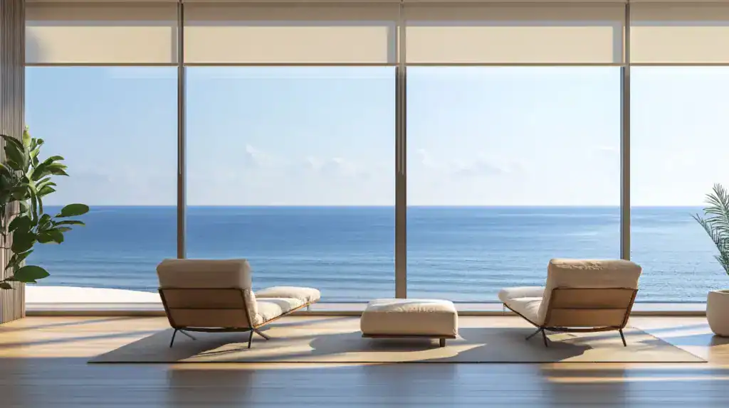
1. Calm & Relaxing Retreat
To create a tranquil and calming environment, choose window treatments in shades of blue. Light blues, in particular, evoke a sense of serenity, making them ideal for bedrooms or areas where you want to relax and unwind.
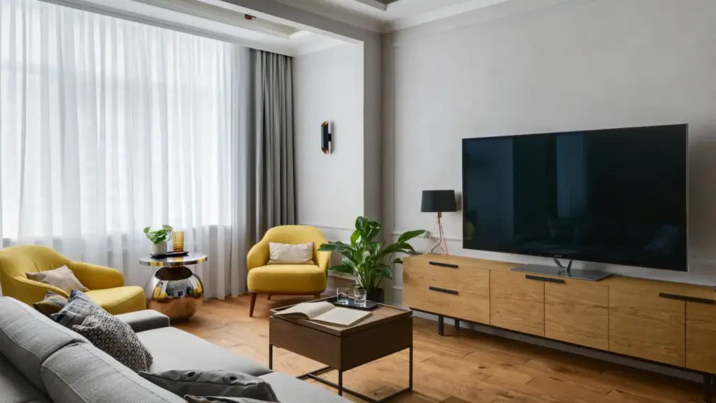
2. Energizing Kitchen
The kitchen is often the heart of the home, and yellow or red window treatments can bring life and energy. Yellow promotes a cheerful atmosphere, while red stimulates appetite and creates a cozy, inviting space for family gatherings.
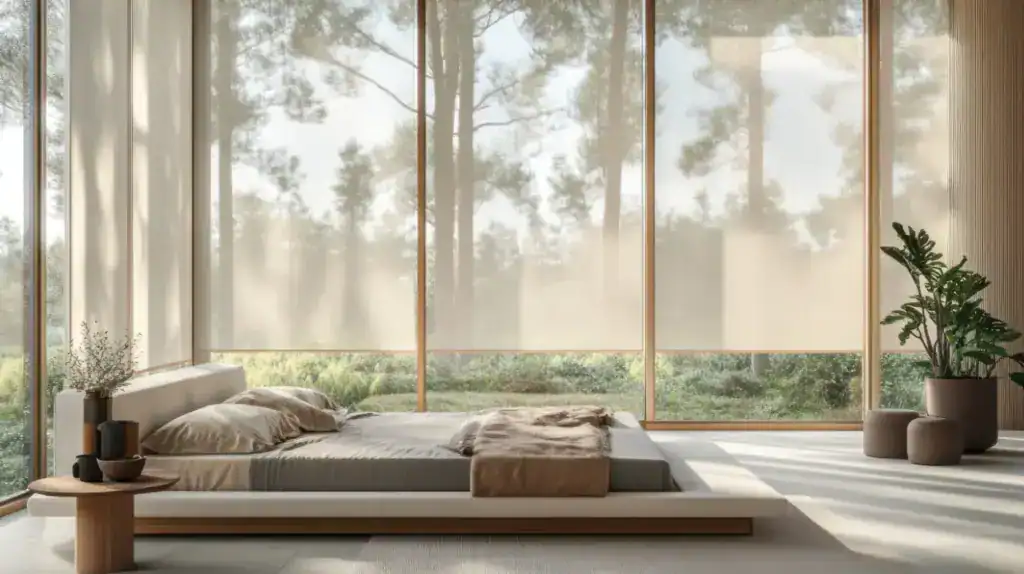
3. Earthy Natural Vibes
If you’re aiming for a connection with nature and a grounded feel, green window treatments are an excellent choice. Shades of green bring a sense of freshness and harmony to your space, making them suitable for living rooms or home offices.
4. Luxurious Elegance
For luxury and sophistication, consider incorporating deep purple or regal violet window treatments. These colors contribute a sense of opulence and creativity to your space, making them perfect for formal dining rooms or home libraries.
5. Versatile Neutrals
Neutral colors like gray, beige, or white act as a canvas for your decor styles. They provide a timeless and sophisticated look while allowing you to introduce color through accessories and accents.
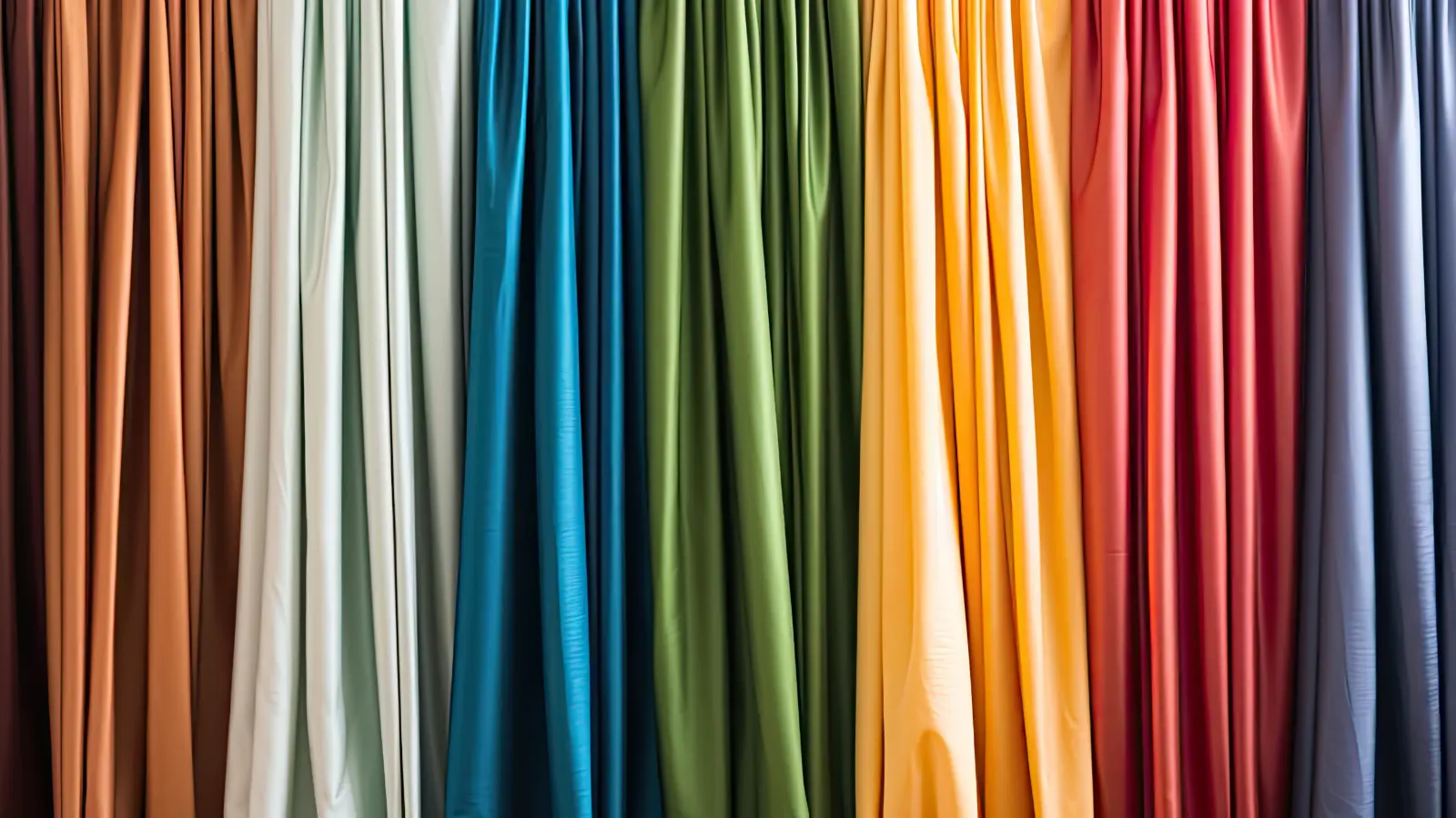
6. Personal Expression
Ultimately, your window treatment colors should reflect your personality and style. Don’t be afraid to mix and match colors that resonate with you. Just remember to weigh the psychological associations of your favorite colors and how they will impact the feel of your space.
Conclusion
Incorporating color psychology into your window treatments can transform your home’s atmosphere. Whether you want a calming bedroom, an energetic kitchen, or a luxurious living room, your choice of colors plays an important role.
So choose your window treatments wisely to create the right mood for every room in your home. And the next time you have a midnight snack attack, consider how the colors in your kitchen may be influencing your cravings. Happy decorating!
Ready to Start? Call Aero Shade
Aero Shade is the premier dealer of window coverings in Los Angeles. We’re the window dressers of the stars and work directly with prominent architects and designers to produce custom window treatments for homes and businesses.
Contact us today to schedule a free consultation and discover what you’ve been missing with off-the-shelf window treatments. We’ll guide you through the customization options, which may be greater than you realize.
If you prefer to see and test working models, please visit our Los Angeles showroom. We’re open Monday through Friday.
FAQs about Colors & Window Treatments
Q: Do I have to stick to one color for all my window treatments?
Absolutely not! Your home is a place for self-expression, so don’t be afraid to mix and match colors that reflect your personality and style. While consistency can create a harmonious aesthetic, a bit of variety can add visual interest.
Q: I love bold colors, but I’m afraid it might be too much. How do I balance it?
If you love bold colors, go for it! You can balance the boldness by pairing it with neutral colors or using the bold color as an accent.
Q: Should I match my window treatments to my wall color?
It’s not necessary to match, but they should complement each other. You can choose window treatments in a color that contrasts with your wall for a pop of color.
Q: What are the trending colors for window treatments?
Trends come and go, but some of the current favorites include earth tones, bold jewel colors, and soft pastels.
Q: What color window treatments should I choose for a small room?
Light colors can make a small room appear larger and brighter. Consider whites, creams, or light pastels.
Q: What color window treatments should I choose for a large room?
Darker colors can bring warmth and coziness to a large room. Consider deep blues, greens, or purples for a dramatic effect.
Q: Can I use patterns in my window treatments?
Patterns can add visual interest and personality to your space. Just be mindful of the size and scale of the pattern relative to your room’s size and other decor elements.
Q: Can I use different colors in different rooms?
Of course! Each room can reflect a different mood or atmosphere. Just make sure there is a coherent flow in your house.
Q: I have a lot of natural light. What color window treatments would work best?
Light colors can enhance the natural light; dark colors can provide a dramatic contrast. It depends on the mood you want to set.
Q: What if I get bored with the color I choose?
That’s the beauty of window treatments. You can easily change them out as often as you want to refresh your space.
Q: Should the color of my window treatments match my furniture?
They don’t have to match, but they should coordinate well with each other. Try choosing a color that’s already in your room’s color scheme.
Q: What colors are best to create a relaxing environment?
Blues and greens are known to be calming colors, making them a good choice for a relaxing environment.