The Art of Matching Window Treatments with Wall Colors
Window treatments do more than block light or add privacy. They frame your space, set the mood, and tie a room together. When paired thoughtfully with your wall colors, curtains, blinds, shades, and drapery become part of a cohesive design story rather than an afterthought.
Here’s how to get that pairing right.
Coordinating Colors
The way your walls and window treatments work together sets the tone of a room.
- Creates harmony. Coordinated colors make a space feel intentional and calm.
- Guides the eye. Smart pairings draw attention to focal points or soften busy spaces.
- Influences perception. The right combination can make a room feel larger, cozier, brighter, or more dramatic.
- Protects your investment. Window treatments are a long-term purchase, so a versatile color choice keeps your room looking fresh as you update your decor.
Matching vs. Contrasting: Knowing the Difference
Both approaches work beautifully. The trick is choosing the one that fits your goals.
Matching (tone-on-tone)
- Treatments sit close to the wall color in shade or family.
- Creates a seamless, expansive, and serene look.
- Ideal for small rooms or minimalist spaces.
Contrasting
- Treatments stand out against the walls.
- Adds energy, depth, and a clear focal point.
- Makes windows a statement feature.
Match when you want subtlety, contrast when you want drama.
How to Pair Different Window Treatments
Each treatment type interacts with wall color in its own way.
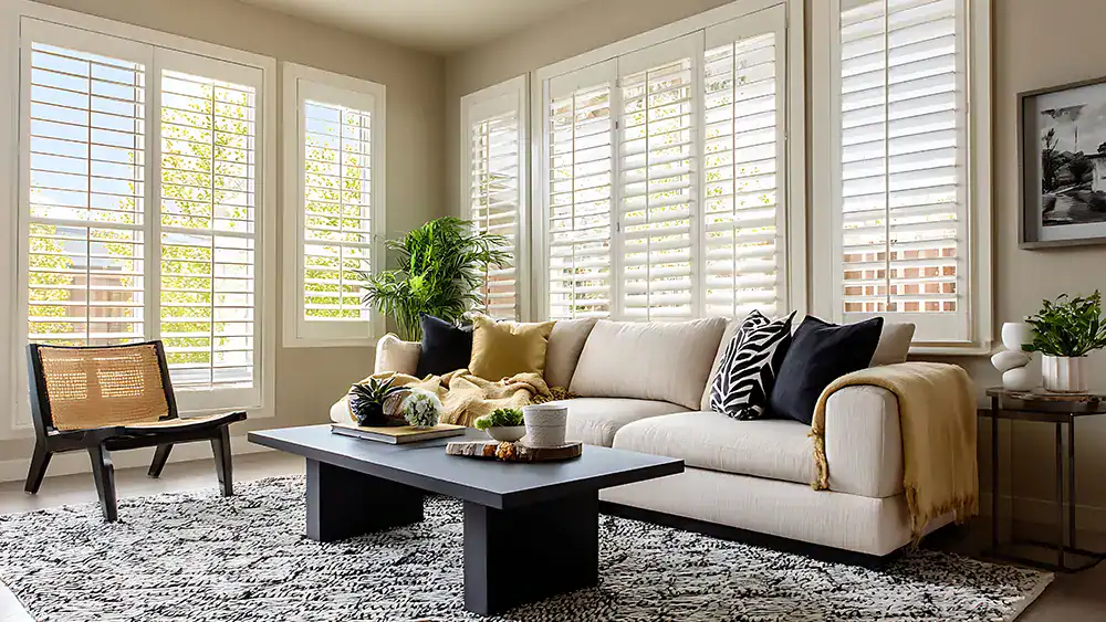
Curtains
- Soft and flowing, they cover a large surface, so their color carries weight.
- Tone-on-tone curtains blend into walls for a polished, elongated look.
- Bold curtains against neutral walls become an instant accent.
Drapery
- Heavier and more formal than curtains.
- Rich, deeper tones suit traditional or elegant rooms.
- Pair with lighter walls so the fabric reads as luxurious rather than heavy.
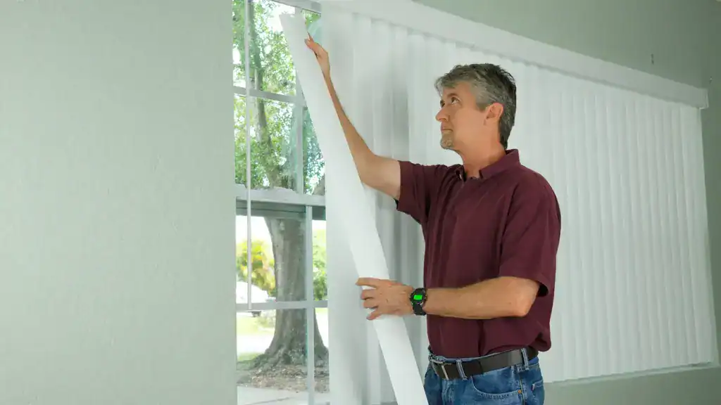
Blinds
- Clean and structured, blinds work well in similar tones to the walls for a streamlined feel.
- Wood-tone blinds add warmth against cool or neutral walls.
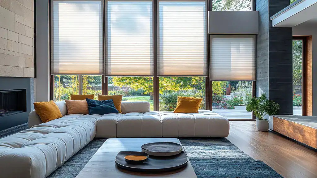
Shades
- Roman, roller, or cellular shades offer a flat surface that clearly shows color.
- Light shades keep airy rooms bright; patterned shades add interest without overwhelming.
Factors That Shape Your Choice
Color is only part of the equation. These elements matter just as much.
Light
- Natural light shifts how colors look throughout the day.
- North-facing rooms feel cooler, so warm treatments add balance.
- South-facing rooms get plenty of light, so deeper tones won’t feel dark.
Room Size
- Light, matching treatments make small rooms feel open.
- Bold or contrasting treatments suit larger rooms that can handle the visual weight.
Mood
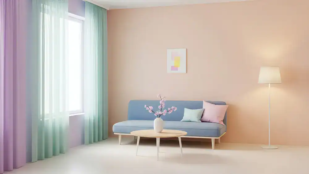
- Soft neutrals create calm and relaxation.
- Deep or saturated colors bring drama and intimacy.
- Crisp whites and pastels feel fresh and energetic.
Undertones
- Every color has an undertone: warm, cool, or neutral.
- Match undertones between walls and treatments to avoid clashing.
- A warm beige wall pairs best with a treatment that carries warm undertones, too.
Texture & Fabric
- Texture adds depth even when colors match closely.
- Linen feels casual and breezy; velvet feels rich and formal.
- Light fabrics filter sunlight gently; heavier fabrics block light and add structure.
Common Mistakes to Avoid
A few missteps can throw off an otherwise lovely room.
- Ignoring undertones. Two “white” pieces can clash if one is warm and one is cool.
- Matching too perfectly. An exact match can feel flat without texture or subtle variation.
- Forgetting the bigger picture. Treatments should relate to furniture and flooring, not just walls.
- Choosing trend over function. A trendy color is no help if it lets in light when you need darkness.
- Skipping fabric samples. Always test fabric against your walls in real lighting before buying.
Practical Tips by Room Type
Different rooms call for different priorities.
Living Room
- This is your showcase space, so feel free to make a statement.
- Layer drapery over sheers for flexibility and depth.
- Tie treatment colors to an accent in your sofa, rug, or artwork.
Bedroom
- Prioritize calm and restful tones.
- Choose blackout shades or lined drapery for better sleep.
- Soft, tone-on-tone pairings create a soothing retreat.
Kitchen
- Keep it light, practical, and easy to clean.
- Café curtains or simple roller shades work well.
- Cheerful colors add personality without crowding the space.
Bathroom
- Opt for moisture-resistant materials.
- Light, fresh tones keep the room feeling clean and bright.
- Frosted or sheer options balance privacy with natural light.
Dining Room
- Drapery in deeper tones adds elegance for entertaining.
- Coordinate with your table setting and wall art.
- Layering adds a sense of occasion.
Quick Pairing Cheat Sheet
- Neutral walls → almost anything works; use treatments to add color or texture.
- Bold walls → keep treatments subtle so the room doesn’t feel busy.
- Dark walls → lighter treatments add contrast and prevent heaviness.
- Pastel walls → soft, complementary tones reinforce the gentle mood.
Bringing It All Together
The best window treatments feel like they belong. Start with your wall color, consider the light and mood you want, then choose a treatment that either blends in or stands out with intention. Pay attention to undertones, lean on texture for depth, and always test in your own space.
With a little planning, your windows become one of the most elegant features in the room.
FAQs: Matching Window Treatments with Wall Colors
Q: Should window treatments match the wall color exactly?
Not necessarily. A close match creates a seamless look, but adding subtle variation or texture usually feels more dynamic than an exact match.
Q: Are matching or contrasting treatments better for small rooms?
Matching, tone-on-tone treatments help small rooms feel larger and more open by reducing visual breaks.
Q: How do I choose treatments for a room with little natural light?
Stick to lighter colors and breathable fabrics to keep the space feeling bright and airy.
Q: What color treatments work with neutral walls?
Almost anything. Neutral walls give you freedom to add color, pattern, or texture through your treatments.
Q: How important are undertones when matching colors?
Very important. Mismatched undertones, like a warm wall with a cool treatment, can make a room feel slightly off.
Q: Can I mix different window treatment types in one room?
Yes. Layering drapery over shades or sheers adds depth and gives you more control over light and privacy.
Q: What treatments are best for bedrooms?
Blackout shades or lined drapery in calm, restful tones support better sleep and a soothing atmosphere.
Q: How does fabric texture affect the final look?
Texture adds richness and dimension, so even when colors match, they look layered and intentional rather than flat.